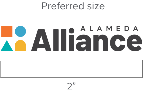
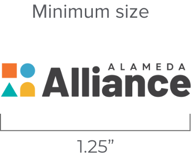
Size
Whenever possible, the logo should be used at a size between 1.25” and 2” on printed materials. The logo is measured from the left edge of the wordmark to the right edge of the “e.”
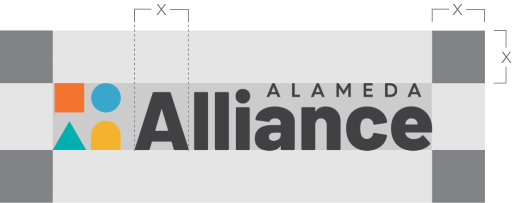
Clear space
The preferred clear space is equal to the width of “X,” as illustrated on this page. “X” is equal to the size of the letter “A” in the logotype.
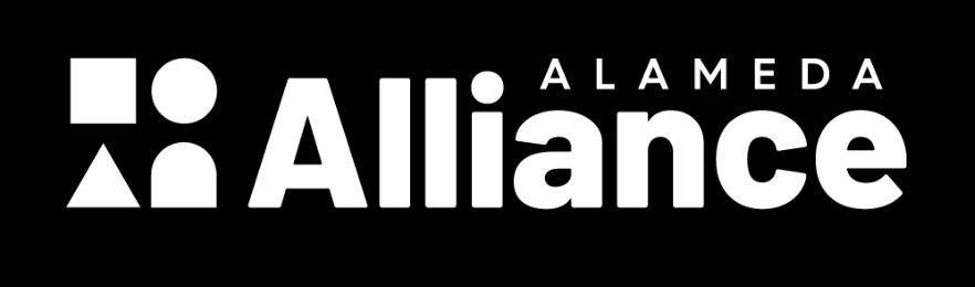
One-color solid logos
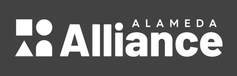
The one-color solid black or white (sometimes called reversed) logos are intended for use when reproduction methods prohibit the use of the full-color logo. However, a one-color logo may be ideal if the logo appears in a busy environment, such as over an image.
Backgrounds
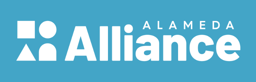
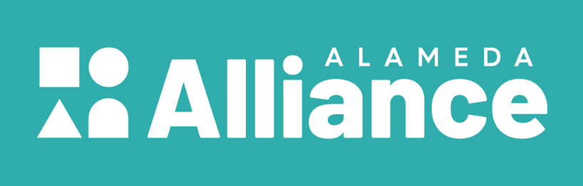
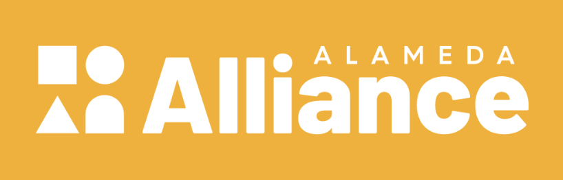
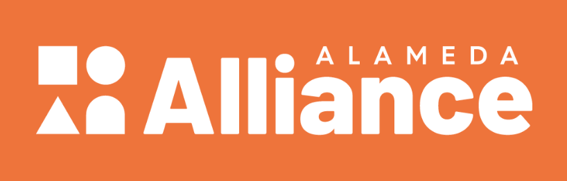
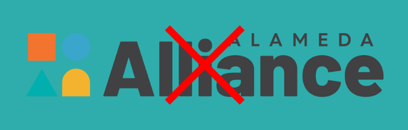
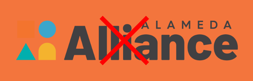
The full-color logo should be used only on solid white to ensure maximum contrast. If the logo is used on a heavy color, the no-color version of the logo should be used unless sufficient contrast allows for a partial knockout, as shown below. The logo should be used on solid-colored backgrounds whenever possible. In the event where the logo is used on an image, special attention needs to be put toward sufficient contrast.
Proportions
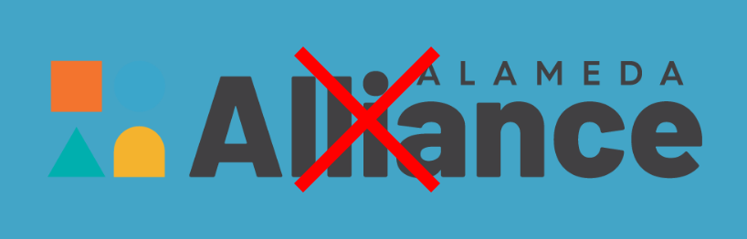
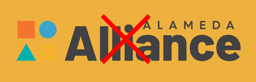
The integrity of the logo must be kept at all times. Altering the logo by ways of stretching, compressing, shearing, or color swapping is not accepted.